The forms editor has been rebuilt. Forms can now be designed — by hand, or by describing the look in a sentence. An assistant writes the confirmation email. Every save is kept and can be restored, and every edit can be undone. Existing forms get all of it the moment they are opened; nothing needs to be rebuilt.
Design Six ready-made looks and a full set of controls, with a live preview
Two assistants One designs the form, one writes the email
Version history The last 20 saves, compared side by side and restorable
Undo and redo Each button names the change it reverses
Major New Features
Design Your Form
The previous editor had no design controls; appearance could only be changed by writing CSS. Now the ✨ Assistant | Preview view puts a design panel beside a live preview of the form, and the preview redraws with every change.
Six buttons — Classic, Modern, Minimal, Warm, Compact and Bold — each set the whole look in one click. Beneath them, the Adjust card controls the accent color, typeface, text size, spacing, corner rounding, labels, field style, button shape and button width. Phone, Tablet and Desktop toggles redraw the preview at each width.
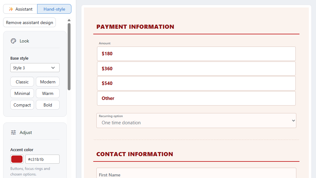
Hand-style: the design controls beside the live preview.
See The Look of Your Form.
Or Describe It
Switch the panel to ✨ Assistant and describe the form in a sentence — Make it feel urgent, like an emergency appeal — and the design assistant proposes a complete look: colors, spacing, typeface and the button. Each proposal is applied or discarded, and follow-ups such as make the button bigger refine the current design.
A reference image can be attached — a screenshot of your website or a printed appeal — and instructions can be spoken instead of typed. Each reply shows what it cost. See The Look of Your Form.
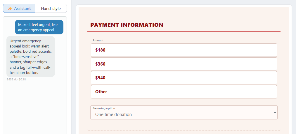
One sentence in, a complete design out.
An Assistant for the Confirmation Email
The confirmation email has an assistant of its own, on the third view of the message. It writes the email from scratch or revises what is there — Make it shorter, Warmer, but not gushing, Add what happens next. It is told what the form collects, so its wording fits: a payment, a monthly gift, a reservation, a dedication.
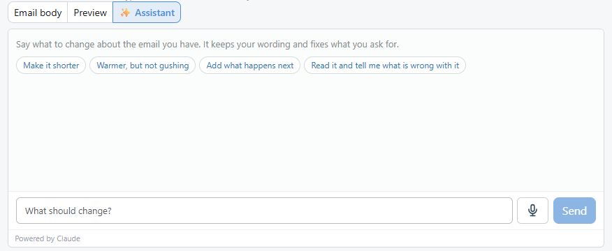
The wording assistant, with suggestions for a message already written.
Both assistants are enabled per organization under Settings → Integrations → AI Assistant. The design assistant does not change wording, and the wording assistant does not change design. See The Confirmation Email.
Every Save Is Kept
The previous editor kept no versions, so a saved change could not be reversed. Now every save records a version, and the 20 most recent are kept for each form. History, on the Forms list, shows what changed between any version and the current form — grouped into Settings, Fields, Design and Code — renders both side by side as working forms, and restores the chosen version.
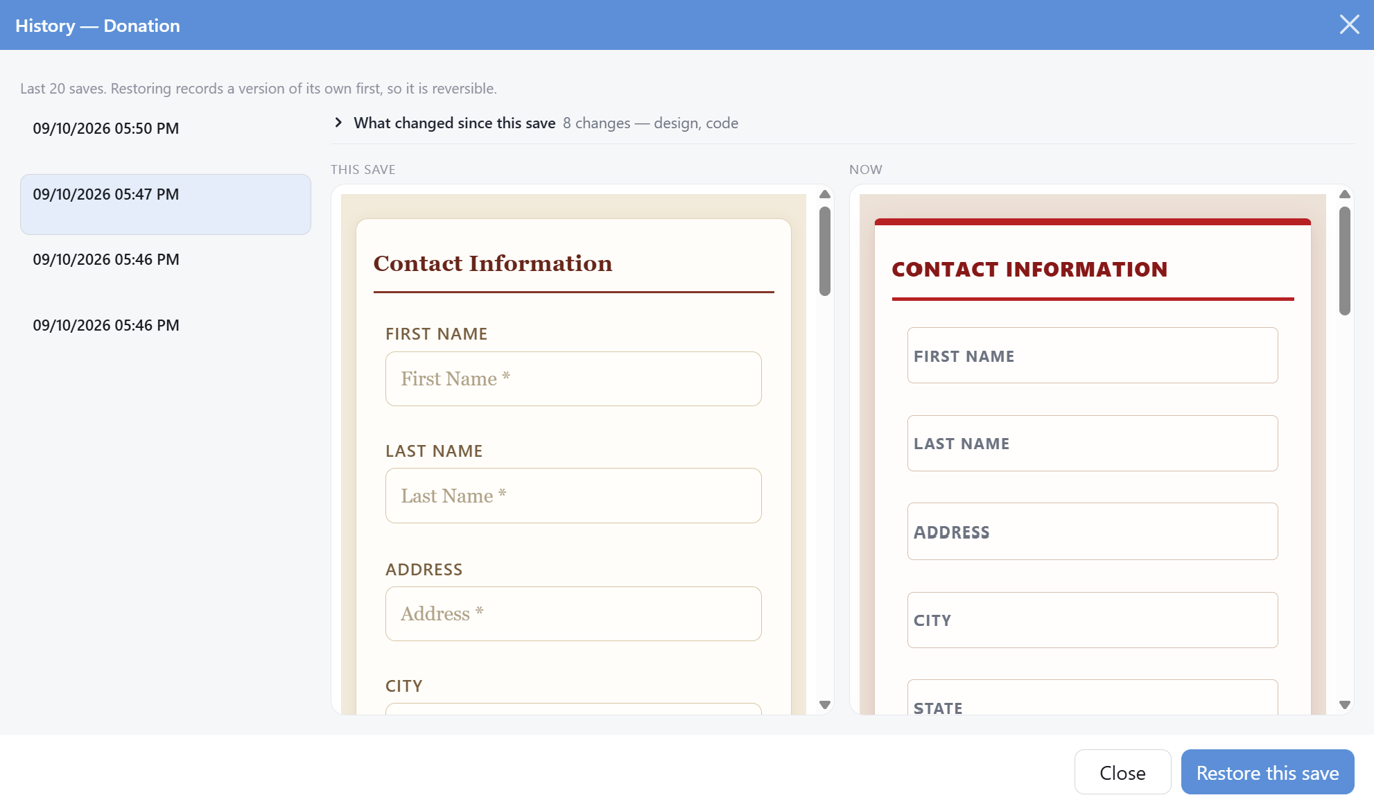
History: an earlier save beside the form as it is now.
See The Forms List & History.
Undo and Redo
There was previously no undo. Undo and redo now cover structural changes, and each button names the change it will reverse before it is pressed.
Start From a Template
A new form starts from Donation, Event registration, Contact form or Blank form instead of an empty canvas. Each card lists what the form arrives with. Setup collects the department, the payment subcategory and, for an event, the reservation items and prices — so the form is complete when the editor opens. The same screen also offers Studio donation, which opens the guided donation-page wizard.
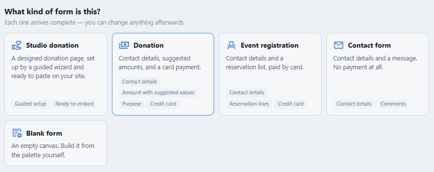
Choosing a starting point for a new form.
See Getting Started.
Edit From a Phone
The editor works at phone width. The palette and properties panels open as sheets over the canvas, tabs are chosen from a picker, and the preview is shown at phone width.
Changes and Tweaks
Building
- The palette has three groups — Groups, Presets and Custom — instead of two tabs with 45 elements collapsed behind a heading.
- A Data Row is dropped and a Field chosen; label, name, ID and input type follow from it. This replaces a 36-item Data type dropdown.
- One name per control everywhere: Dropdown, Choice list, Long text and Divider, previously Select, Radio, Text Area and HR Element depending on the panel.
- A Structure view tags every container and element, with each mapped element's data type beside it.
- Save is blocked while something required is missing, and names it: a form name, a department, a payment subcategory, or a reservation list with no items.
See Building Your Form.
Donations
- Payment Information opens with amount choices — $180, $360, $540 and an Other box — instead of an empty number field.
- The Amount choices dialog takes a value, title, description and memo for each choice, and a choice can hide other fields, by element ID, while it is selected.
- An amount title typed by hand is kept when its value is edited; previously it reverted to the currency figure.
- Contact Information no longer opens with the Title field, which remains available from Presets.
paymentDate and paymentCategoryId were removed from the field picker; paymentDate remains available as an email merge field.
See Donations & Reservations.
Confirmation email
- The email takes the form's colors and typography when it is sent, so the two always match.
- Send a sample emails the draft with sample data. There was previously no way to see the email without submitting the form.
- The message has three views — Email body, Preview and ✨ Assistant — and the body is a rich text editor.
- Merge fields are added from Insert a field… and appear as chips. The list holds only what the form collects, so a field that would arrive blank cannot be chosen.
{{FieldList}} inserts a summary of everything submitted, and follows the form's fields as they change.
See The Confirmation Email.
Settings
- Three screens instead of one long page: Where submissions go, After a submission and Embed on your website.
- The on-screen confirmation message is a rich text editor, and choosing a popup adds a required When dismissed, go to setting.
See Settings & Putting the Form on Your Website.
Forms list
- A search box, status chips, and Test mode and New submissions toggles replace two checkboxes.
- Status is a column, not only a filter.
- Delete is disabled on a form with submissions, and says why. Previously the button looked available and did nothing.
- Any form can be previewed in a new tab.
- Date Modified shows in your organization's timezone.
- The list loads less: it no longer returns each form's contents, and a filter change sends one request instead of two.
See The Forms List & History.
Unchanged
- The same five tabs, in the same order.
- Bot protection and declined-card behavior, with the same settings and defaults.
- Sorting, duplicating and deleting on the Forms list.
- The form visitors fill in. The building blocks were carried over unchanged, so a published form behaves as it did.