Appearance is set on the ✨ Assistant | Preview view of the Editor tab. The design panel sits on the left and a live preview of the form on the right; the preview redraws as settings change.
The panel has two modes, selected by tabs at its top: ✨ Assistant, which takes a description in plain language, and Hand-style, which exposes the individual controls. Both change the same design and can be used in either order.
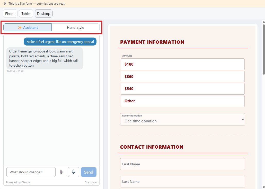
The split view. Boxed: the two panel modes.
A banner above the view reads "This is a live form — submissions are real." The preview is the actual form, not a mock-up, so submitting it from here creates a real submission and a real charge.
Preview Widths
Three toggles above the panel — Phone, Tablet and Desktop — redraw the preview at that width. Desktop fills the available space. No browser resizing is involved.
On a phone the editor uses the full viewport, the preview is shown at phone width, and the toggles are not offered.
Hand-style: the Controls
The Hand-style mode is arranged as two cards.
Look
Base style is a dropdown of the ready-made looks built into the form's stylesheet: Plain (no styling), Style 1, Style 2 and Style 3. The Adjust controls are applied on top of it, and the base style still governs what they do not set, such as input border colors and the checkbox tick.
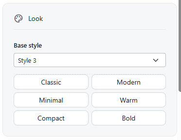
The Look card.
The six buttons beneath the dropdown each set every control in the Adjust card at once:
| Button | Sets |
|---|
| Classic | Boxed fields, labels beside them, comfortable spacing |
| Modern | Labels above, roomy spacing, full-width button |
| Minimal | Underlined fields, square corners, outlined button |
| Warm | Serif typeface, labels above, softer accent color |
| Compact | Tight rows, smaller text, labels beside fields |
| Bold | Large text, pill-shaped full-width button, roomy spacing |
Choosing one shows the notice Design set to Modern (or whichever was chosen) with an Undo link that restores the previous settings. The button stays highlighted while the Adjust controls still match it, and every control remains adjustable afterwards. Hovering over a button shows a one-line description of it.
Adjust
| Control | Sets |
|---|
| Accent color | A swatch and a hex field. Applied to buttons, focus rings and chosen options |
| Typeface | System, Helvetica, Segoe or Georgia |
| Text size | The base text size, in pixels, from 11 to 24 |
| Spacing | Compact, comfortable or roomy row spacing |
| Corner rounding | Corner radius, in pixels |
| Labels | Beside the field, Above the field, Floating in the field, or Placeholder only. Placeholder only hides the labels on screen but keeps them for screen readers |
| Label width % | Shown only when labels are beside the field. The label's share of the row, from 15 to 60 |
| Field style | Boxed or underlined |
| Button | Solid, outlined or pill |
| Button width | Fits its text or Full width |
Reset to base style, at the foot of the Adjust card, appears once a design is in place. After a confirmation it deletes everything the design controls generated, returns the controls to their defaults and removes the assistant's design, leaving the form on its base style. CSS entered in the Custom CSS box on the Advanced tab is kept.
Floating labels
A floating label starts inside the field and lifts to the corner once the field has focus or content.
The option needs the label and its control to sit in the same container. On older forms laid out as two-column rows they sit in different containers, and the option is shown grayed out; one qualifying row on the form is enough to enable it. A form already saved with floating labels keeps showing that setting.
The Design Assistant
In ✨ Assistant mode the controls are replaced by a conversation. Describing the design in plain language produces one, and the preview beside it updates when a proposal is applied.
Describe it Type, speak, or attach a reference image
→
It proposes a design Colors, spacing, type and the button
→
Apply or discard Nothing changes until applied
Openers are offered on an empty conversation:
- Warm and traditional, easy to read on a phone
- Clean and modern — lots of white space
- Match our website: navy and gold
- Make it feel urgent, like an emergency appeal
The composer below the conversation holds a message box, a paperclip for attaching a reference image, a microphone for spoken input, and Send. PNG, JPEG, GIF and WebP images are accepted, and an image can also be pasted straight into the box.
The conversation is kept with the form, so earlier instructions stay in context and follow-ups such as make the button bigger or that green is too dark apply to the current design. Each reply shows what it cost, as a token count and an amount, and Start over at the foot of the panel clears the conversation.
The assistant changes appearance only. Fields, labels, wording and settings are unaffected.
Going back to the controls
Switching to Hand-style keeps whatever the assistant produced. Remove assistant design, at the top of the Hand-style panel, discards its work while keeping the style, accent color and control settings.
Where both have set the same property, the assistant's design takes precedence and the corresponding control can appear to have no effect. Removing the assistant's design restores the controls' behavior.
The assistant is enabled per organization under Settings → Integrations → AI Assistant. When it is off the mode is still shown and says so, with a link to the setting. Everything else on this view is unaffected.
The Confirmation Email
The confirmation email takes the form's colors and typography at the time it is sent. There is no separate design to set, and changing the form's design changes the email. See The Confirmation Email.
ADVANCEDCustom CSS
The Advanced tab has a Custom CSS box, applied on top of everything set on this view.