This article covers the fields a form asks for: adding them, arranging them, labeling them, and declaring what each answer represents in your database.
The Palette
Add an element opens the palette, which holds three groups.
Groups Contact Information · Payment Information · Guest Reservation · Credit Card Information · Other Information · Action buttons
Presets Data Row · Donation Amount Choices · Payment Method · Donor Processing Fee · Promo Code · Reservation Amount · Total Amount
Custom Section · Section title · Input row · Dropdown row · Choice list row · Checkbox row · Layout row · Layout column · Label · Input · Long text · Dropdown · Choice list · Button · Checkbox · Divider
Groups add a whole block of related fields in one action. Contact Information brings in name, address, city, state, zip, phone and email; Credit Card Information brings the entire card section. Every field in a group arrives labeled and already mapped to its database equivalent.
Presets are single controls with their own settings screens. Most relate to payment and are covered in Donations & Reservations. The exception is Data Row, a labeled field where you choose which piece of information it collects.
Custom holds individual elements — a dropdown, a checkbox, a long text box, a divider, a section heading — for cases a group or preset doesn't cover.
Selecting, Moving and Removing
Clicking an element selects it, outlines it, and shows a small toolbar above its top-right corner.
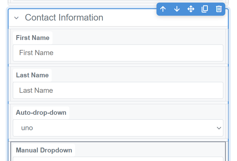
A selected section, with its toolbar above the top-right corner.
| Button | Effect |
|---|
| Move up / Move down | Moves the element one position within its container |
| Move somewhere else | Relocates the element to another position or container |
| Duplicate | Copies the element in place. Keyboard shortcut Ctrl+D |
| Delete | Removes the element and anything inside it |
The toolbar shows only the buttons that apply to what is selected. A section offers all five. A section title offers Delete alone, since it cannot be moved out of the section it names, and a layout column offers none.
Sections contain rows, and rows contain fields, so a click can land on a container rather than the field inside it — and clicking again on an already-selected element selects its parent. The properties panel always names what is currently selected, and shows the containers it sits inside. Deleting a section removes its contents with it; Undo reverses this.
The Properties Panel
The panel is headed with the type of the selected element — Input Properties, Section Properties, Dropdown Properties — followed by a chip naming that particular element. Beneath it, an In: line lists the containers it sits inside, so the position is readable without hunting for it on the canvas.
On a text input, the settings are:
| Setting | Controls |
|---|
| Name | The element's name, used when the submission is recorded |
| Default value | The value the control starts with |
| Placeholder | Hint text inside an empty control, cleared as soon as the visitor types |
| Type | The kind of input — text, email, telephone, number and so on |
| Required | Whether the form can be submitted without it. The marker shown to visitors is added automatically |
| Label | The wording shown beside or above the control |
Other element types show their own settings: a dropdown or choice list adds Options, and a section carries a Type that says what the block is for — Contact, Payment, Credit Card or Guest Reservation — which is what tells the system how to treat the fields inside it.
Settings that do not apply to the selected element are not shown, and every panel ends with an Advanced expander.
ADVANCEDRemaining settings
A second, collapsed list holds the element's technical attributes — input patterns, element names, IDs, row counts and similar. Nothing in ordinary form building requires it.
The Field Setting
A Data Row from Presets carries a Field setting, which declares what the row collects. It determines how the answer is filed: choosing Email files the answer as the person's email address, and choosing Last name as their surname. Choosing a Field also sets the row's label, name, ID and input type in one action, rather than leaving each to be set by hand.
| Category | Fields |
|---|
| Person | Title, First name, Last name, Date of birth |
| Contact | Email, Phone, Address, City, State, Zip, Country |
| Gift | Amount, Note, In honor of, In memory of |
Fields added as part of a group are already mapped. The setting only needs attention on elements you add individually.
Leaving Field unset
An element with no Field is a valid choice, not an incomplete one. "How did you hear about us?" has no database equivalent.
The answer is still included in the notification email, shown on the submission, and included in exports. It does not populate a field on the family record.
Structure View
Structure, one of the three views in the Editor tab, presents the form as a nested outline. Every container and element is tagged with what it is, so nothing has to be identified by clicking on it.
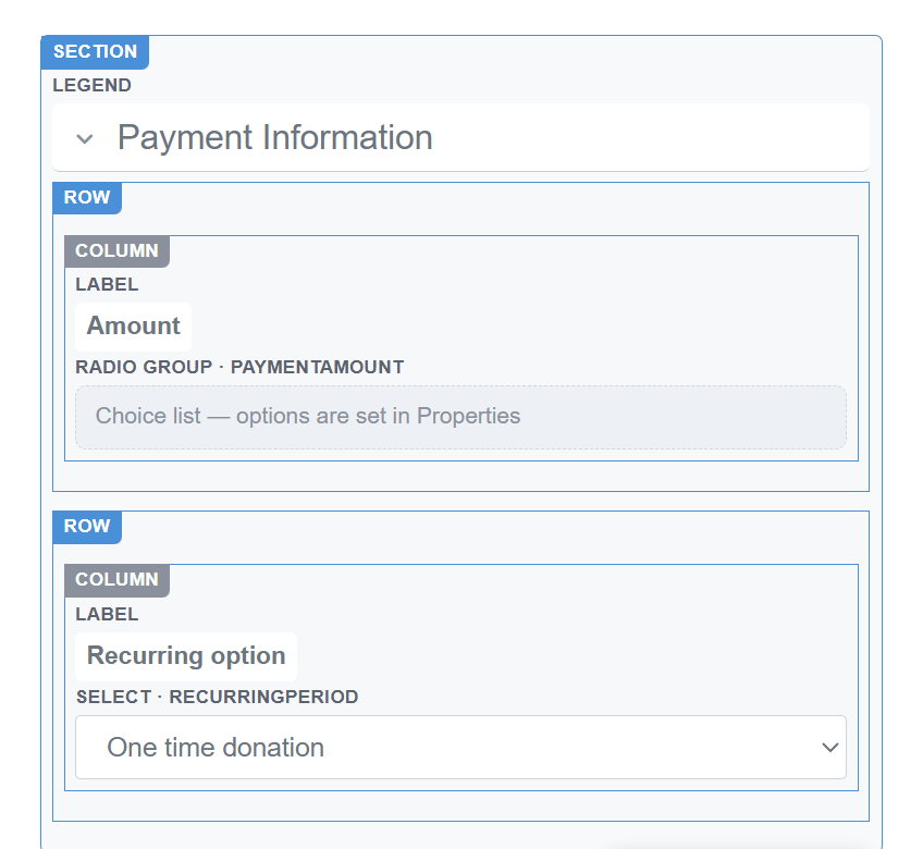
Structure view. Every container is tagged, and mapped elements show their data type beside the element type.
Containers are tagged SECTION, LEGEND, ROW and COLUMN. Elements are tagged with their type and, where the element is mapped, the data it collects — so the amount control reads RADIO GROUP · PAYMENTAMOUNT and the recurring dropdown reads SELECT · RECURRINGPERIOD. This is the quickest way to confirm what a field is actually mapped to.
Elements are selected and moved from the outline rather than from the rendered form, which makes relocating a whole section a single action.
Undo and Redo
Undo and Redo sit beside Save and cover structural changes: additions, deletions, moves and renames. Each button names the change it will reverse.
Configuration screens — the giving amounts, the guest list, promo codes, the processing fee — count as a single step per save. Undo reverses the whole screen rather than individual values within it.
Undo covers the current editing session only. Changes saved earlier are reversed through History, described in The Forms List & History.